Design System Redesign
The Challenge
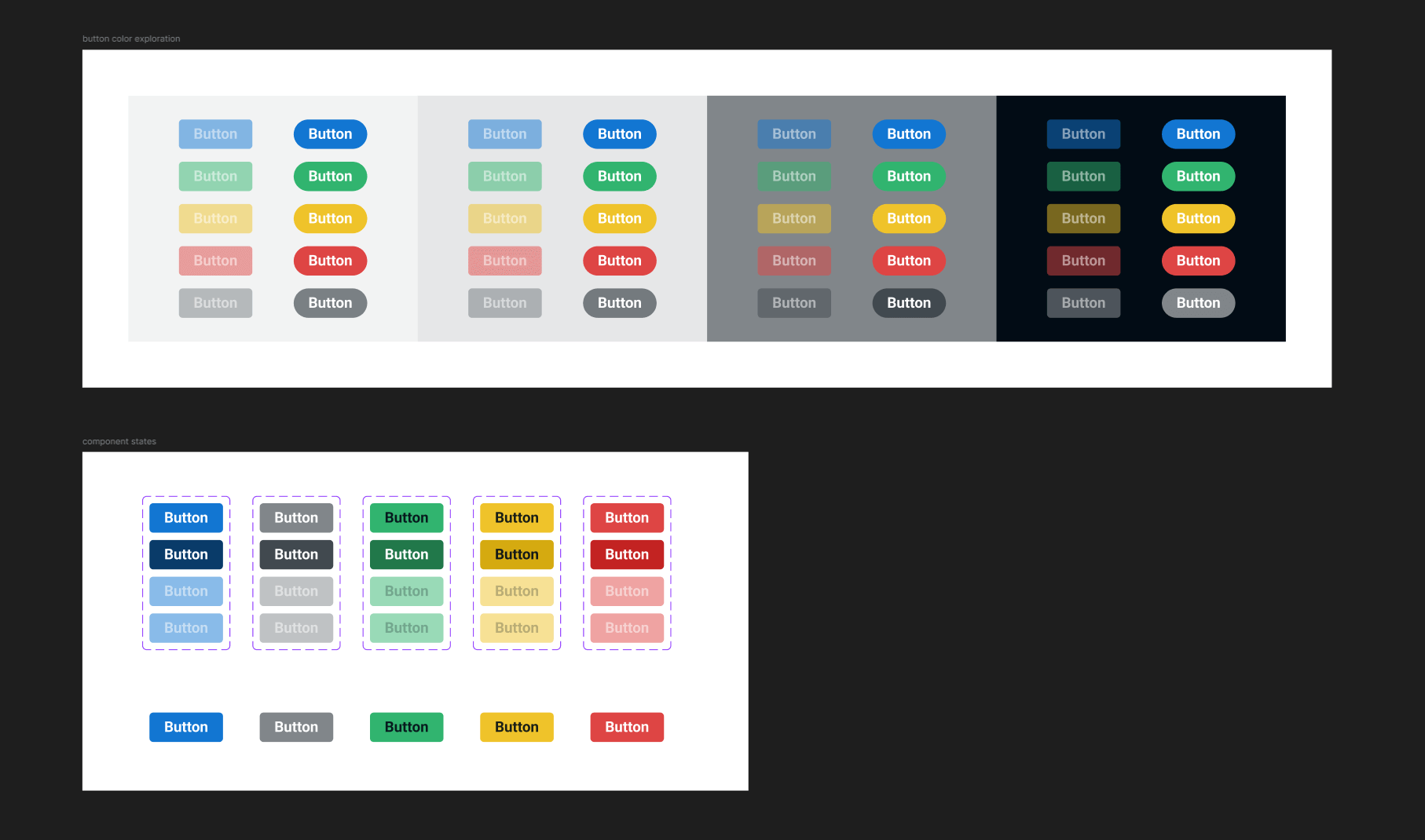
I reimagined the design system and explored several design possibilities. The previous design system was dated in both style and Figma tool usage (i.e., layout and components). Many components were deprecated and could be remade more efficiently, along with new system requirements. - Updating this would allow us to refresh the style, take advantage of the Figma tools/features that have been released since the original system was made 3 years prior.
My Role & Process
My responsibilities as the Lead UI/UX Designer were to review all the existing design system elements, perform a design audit to detect and analyze what components and elements need rework, and finally update them according to brand guidelines I had previously established. I took in feedback from stakeholders, the marketing team (in order to target specific screens that would benefit their promo usage), and my design team. The key methods I used were with wireframes and prototypes. After my internal design audit, I had detected many components that would benefit from both a style refresh as well as a component restructure.
Solution
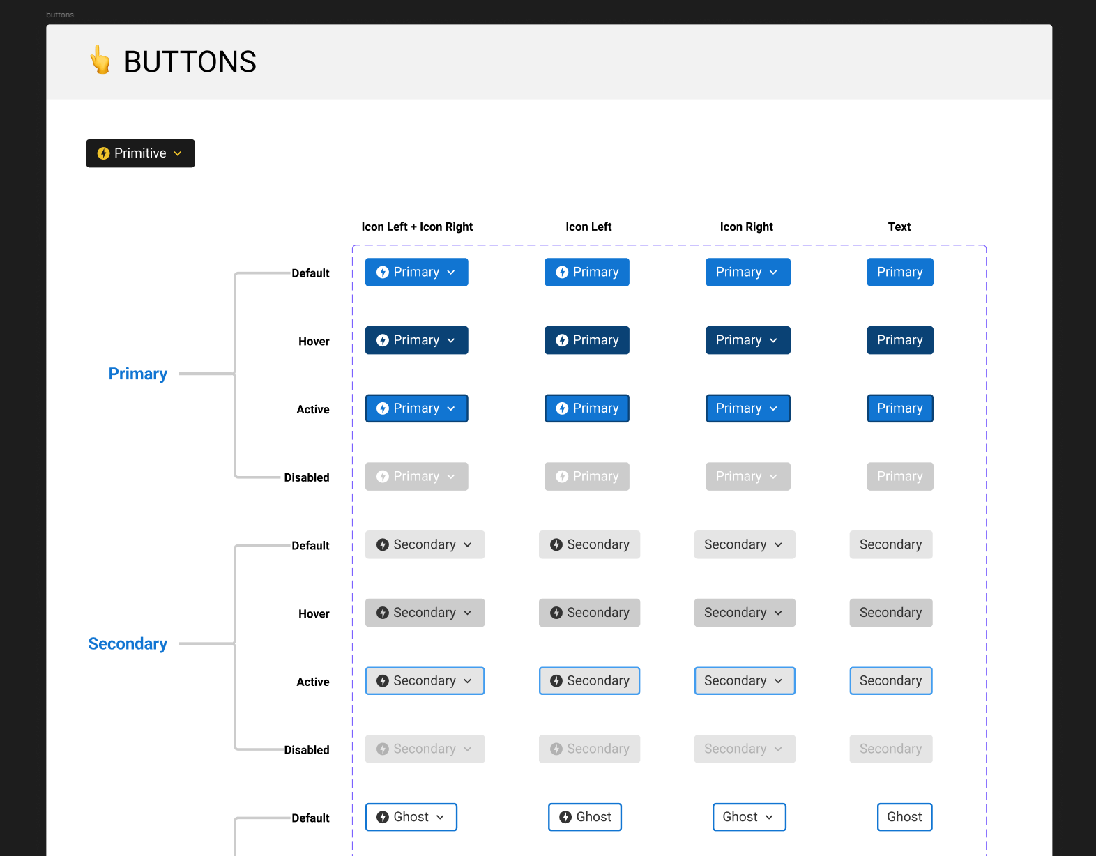
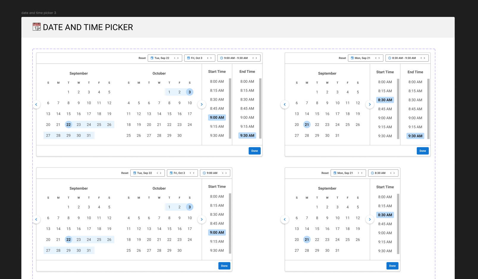
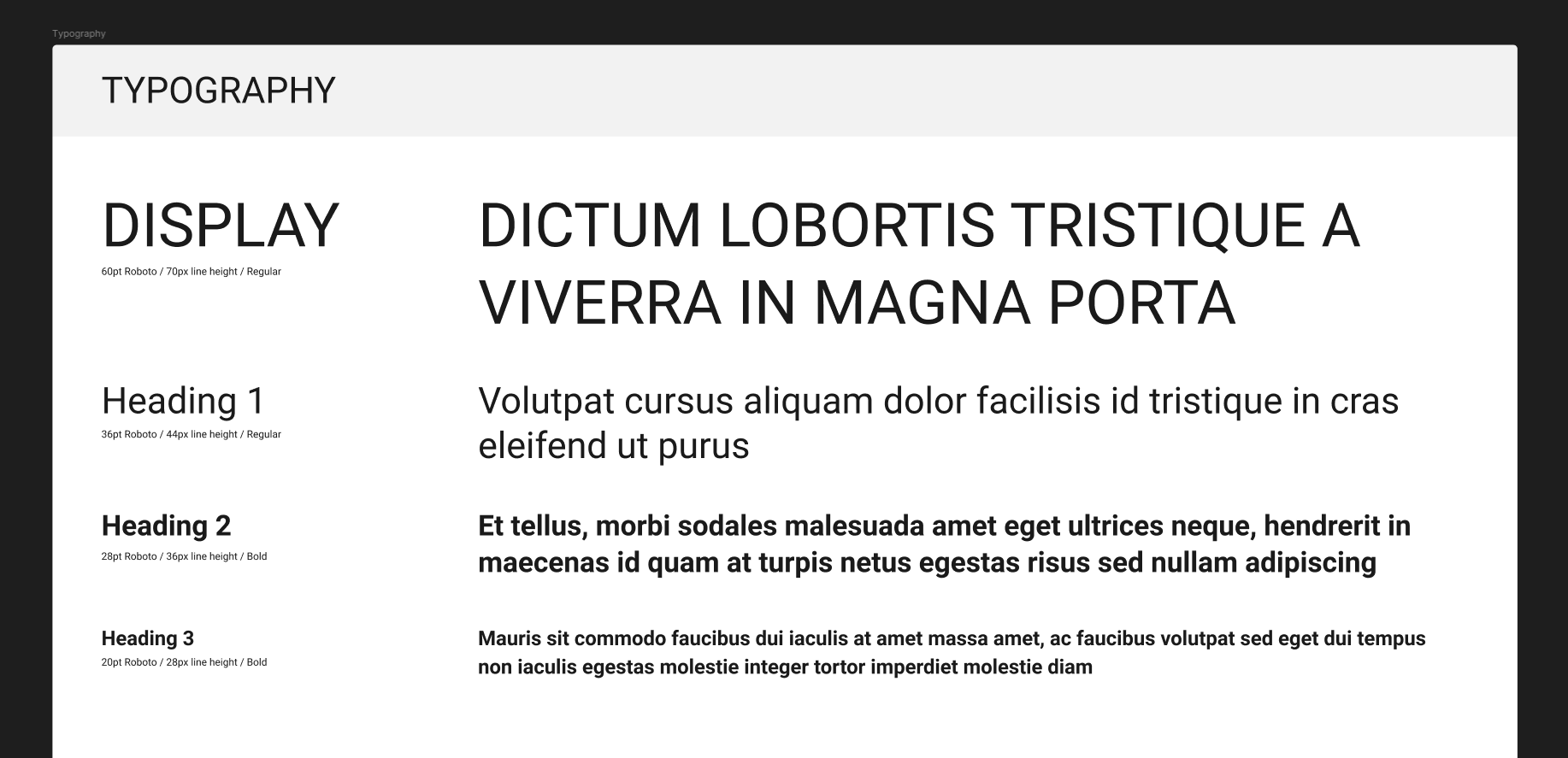
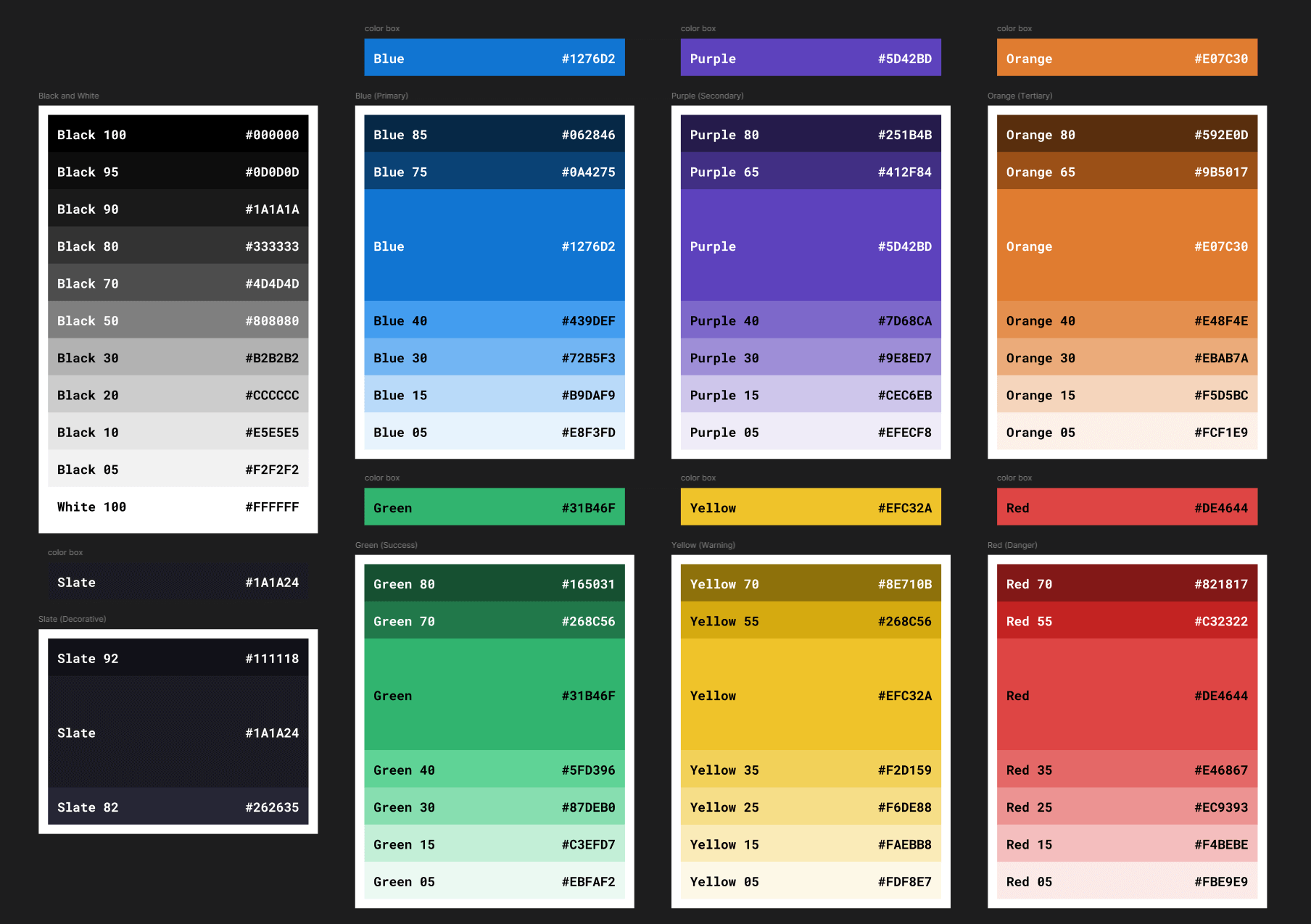
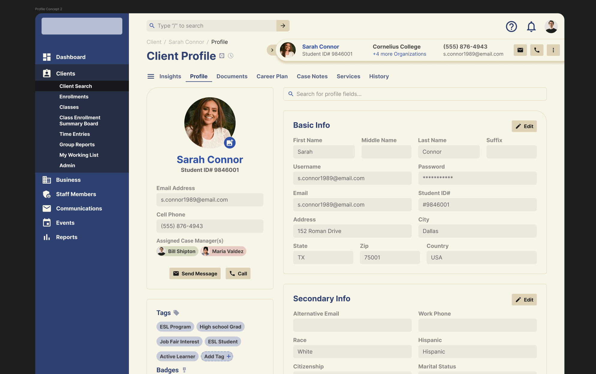
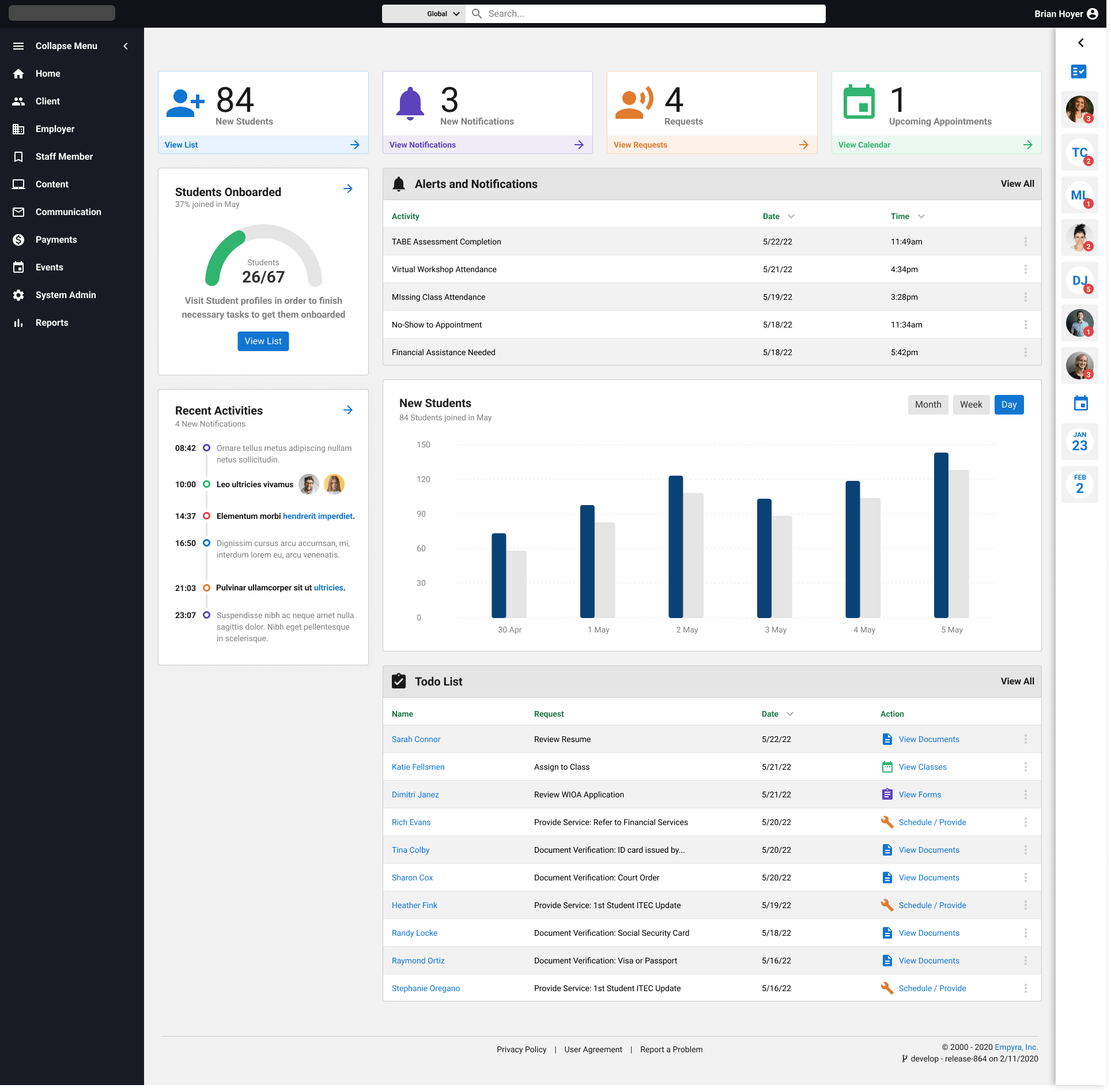
I combed through each component to see if they could be built more efficiently and leverage any new Figma features, such as Variables and Auto Layout updates. - I selected components that would have the largest impact on the design, such as fonts, colors, buttons, and modals. I researched external design systems to see how they came to similar conclusions when defining color palettes and font decisions. I discussed with my design team to gather any feedback or suggestions, and incorporated anything that made sense. Finally, I implemented these changes in a new Design System Figma file, taking into account variations that all needed to be replicated, if not reduced, thanks to Figma's component system updates. I took these new element components and made larger shared components such as modals, tables, and input fields.
Results & Impact
After launch, I sent new screenshots and prototype links to stakeholders and the marketing team, so they would have access to these new design assets to show to clients and promote the product. I walked through major design changes and briefly covered minor changes to point out the small but still important design upgrades. Feedback from all departments was extremely positive. We had a few extra design concepts that many people wanted to keep pursuing, which we set as targets for review months in the future. The design and ease of use of the new components were welcomed by all teams. Client feedback was very positive, according to stakeholder and marketing demos that were performed using the new screenshots and prototypes.
What I learned
The major takeaways were two-fold: 1) It's important to gather input from multiple teams, and critically examine what will bring a positive impact and what would be a nice-to-add design element in the future. 2) It's helpful to review internally with your design team to get an outside perspective to challenge your biases when it comes to redesigning something as critical as the design system.