GoHard Energy Website
The Challenge
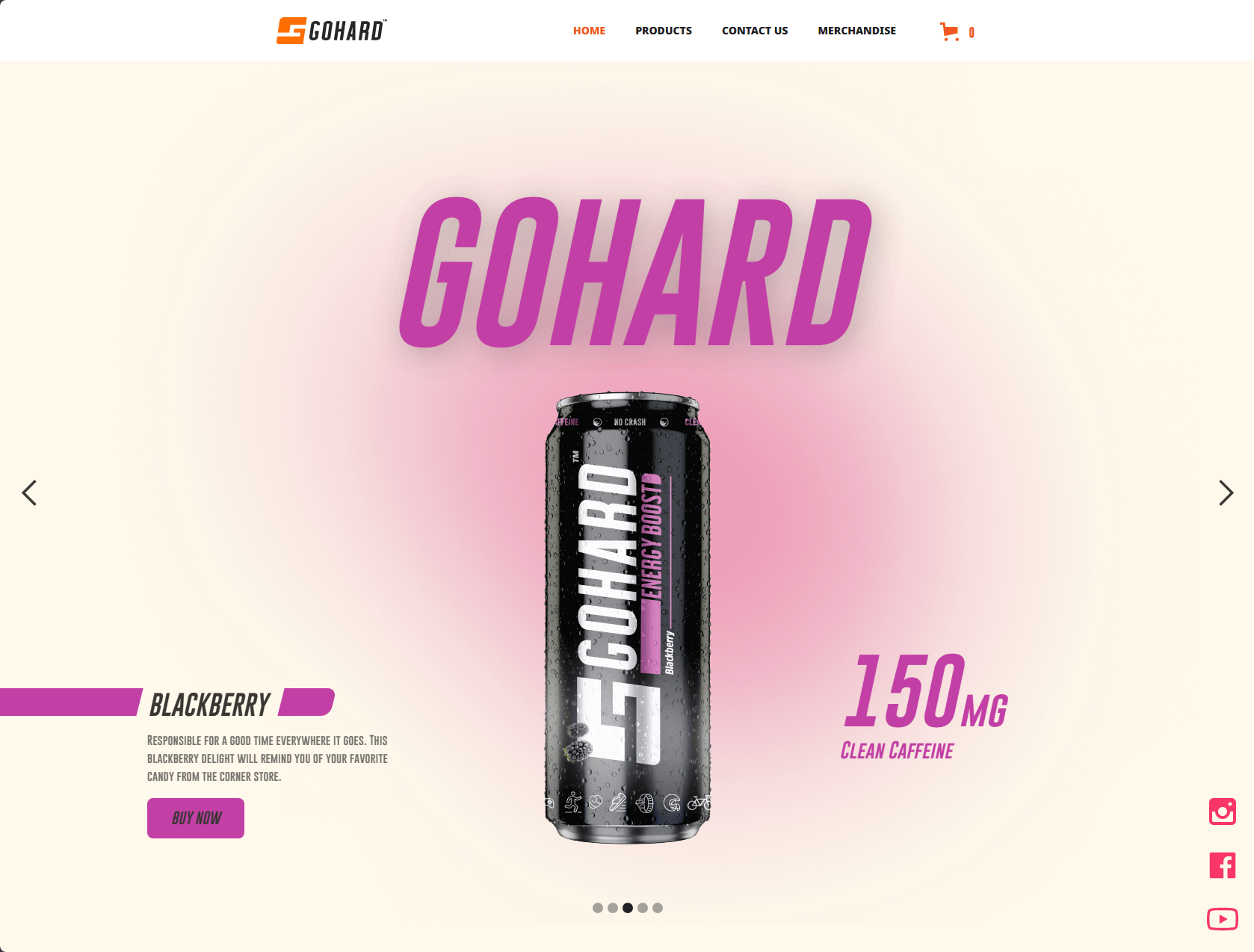
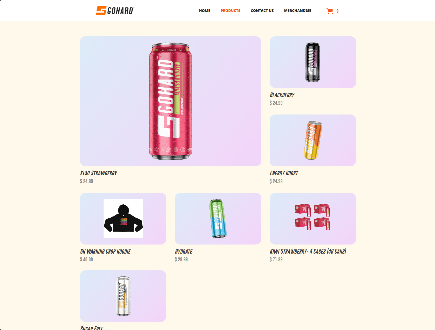
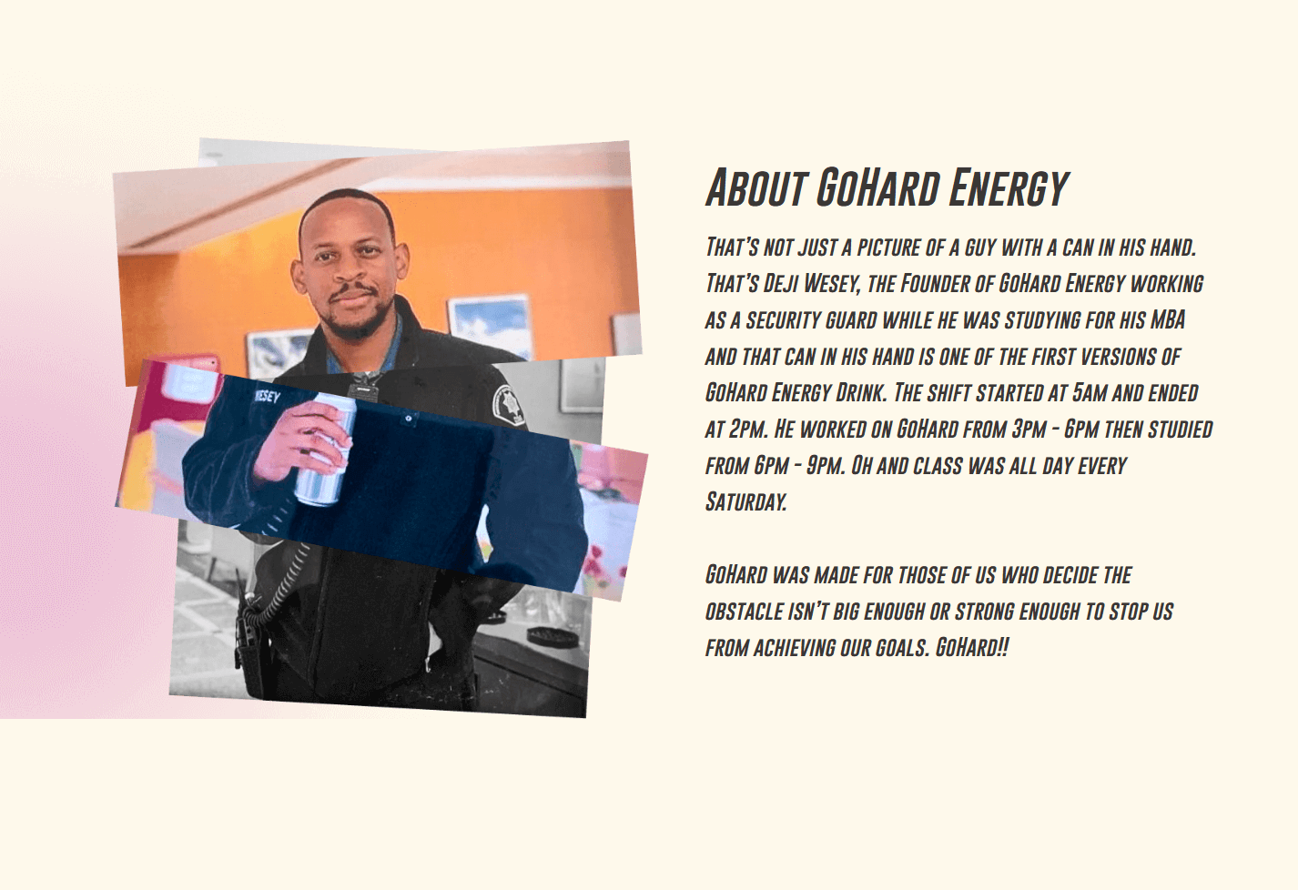
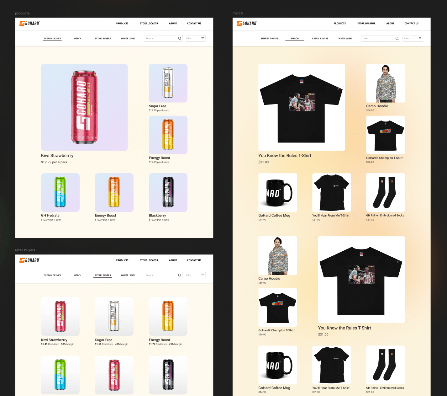
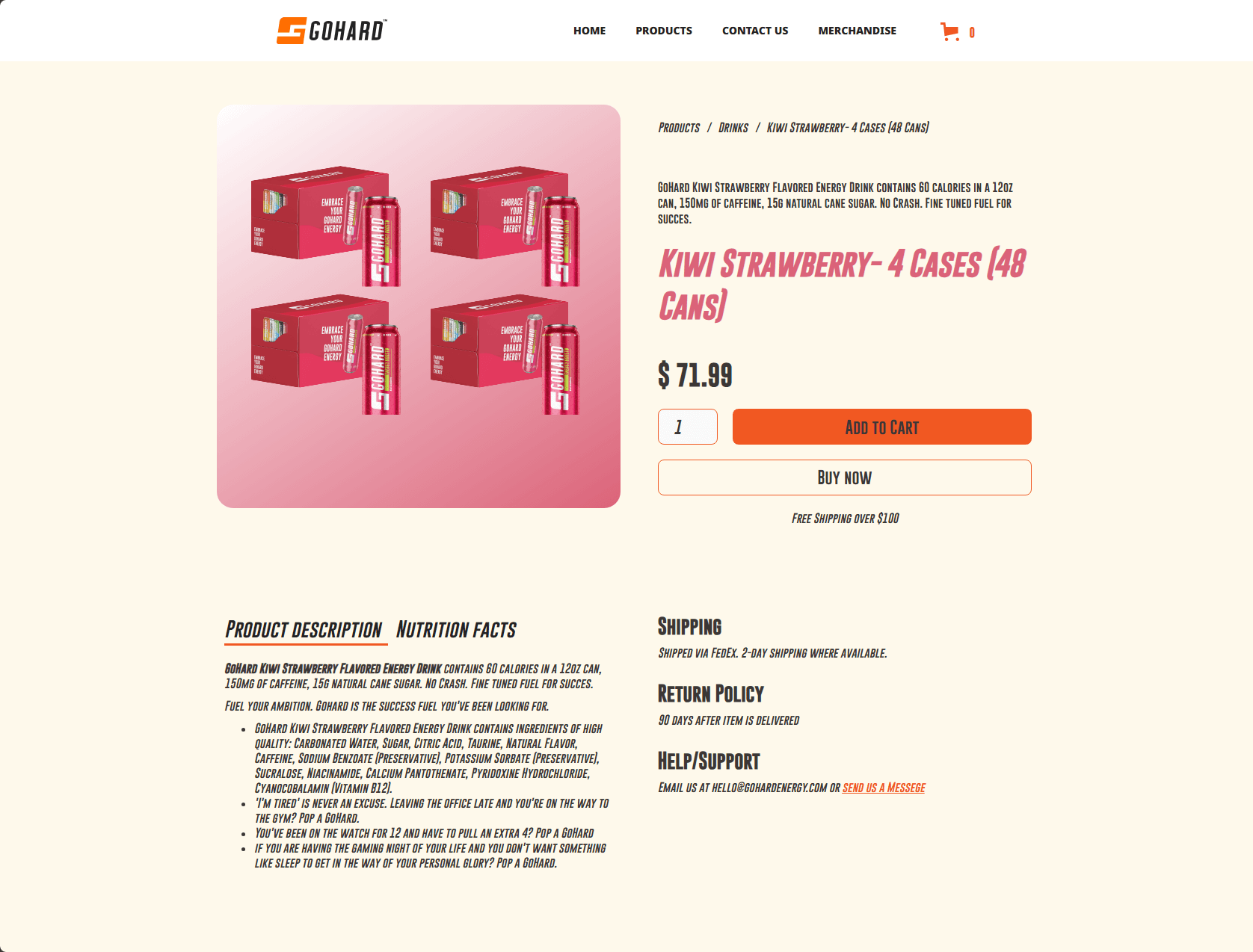
I redesigned the GoHard Energy website collaboratively with the talented designer, Kate Chaparro. GoHard Energy needed a new brand identity to house their commercial energy drink product line. We were tasked with exploring and providing several concepts that would excel in giving the product line a strong impact and allow users to purchase products online via an e-commerce experience. The previous website did not have an e-commerce shop or a strong brand identity. The owner of the company, Deji, already had great photography to start working with, so we just had to find a cohesive design aesthetic to centralize the website around.
My Role & Process
I worked directly with Kate on calls with the client and collaboratively worked on different design aesthetic concepts. We explored several potential styles during the research stage and created. Gathering all these different concepts on a mood board helped us to see which pieces worked and which didn't, to showcase the brand successfully. After reviewing internally and presenting several themes to the client, we settled on the strongest contender.
Solution
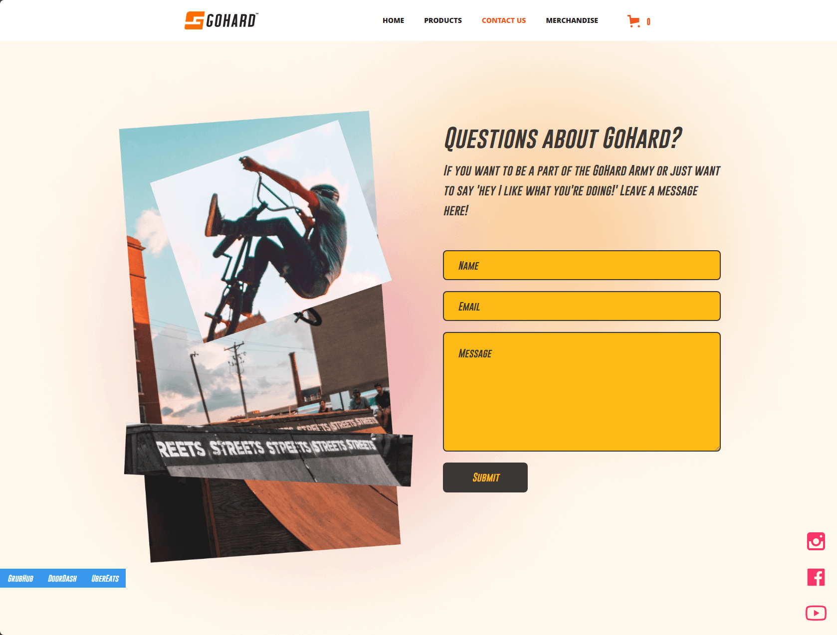
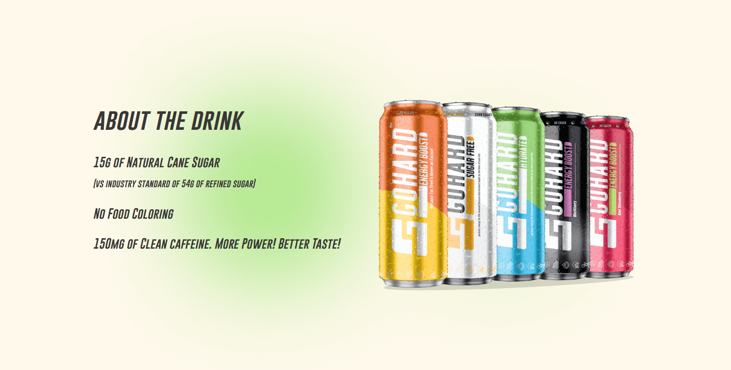
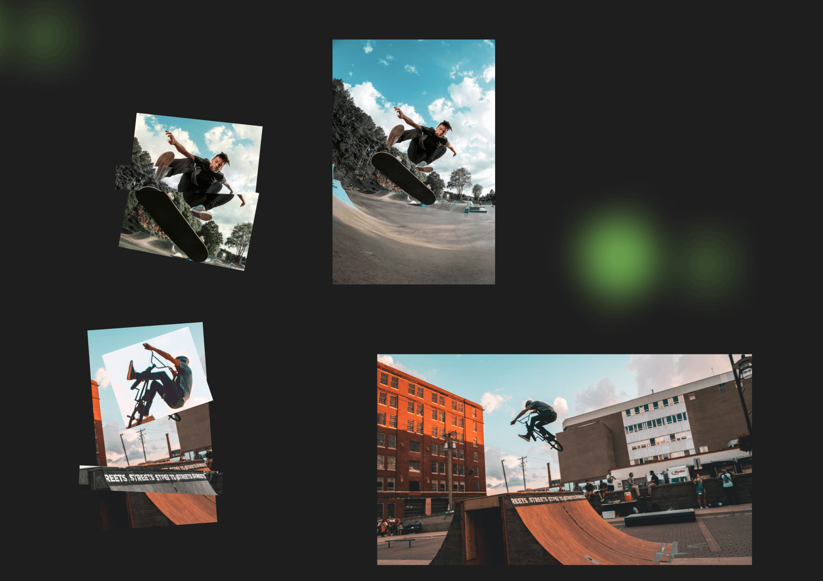
We landed on a '90s punk and skater/sport culture with some clean collegiate athlete elements, mainly around the font to keep things readable. The photography was a perfect collection of outdoor active shots that lent themselves well to be modified and transformed to have a "scrapbook artsy" aesthetic. This style was also similar to high school yearbook/scrapbook and magazines in the late 90s and early 00s. We wanted to emphasize the active elements of the product experience. Deji worked hard to develop the product to be a healthy alternative to most energy drinks and to emphasize natural ingredients. We wanted to tie in the health aspects with active outdoor activities.
Results & Impact
The feedback after launch was very positive. Beyond the client expressing that the website design and layout had exceeded his expectations, the feedback he got from his associates and internal team was highly supportive of the new look and feel. He had reported that his customers really liked the style we went with. Google Analytics showed an increased flow of traffic compared to his previous website. The word of mouth he got from his customer base was supportive of the new themes that we chose.
What I learned
Collaborating with a talented designer like Kate was a blessing. We were able to bounce ideas and design elements off of each other, so we had an even stronger, more cohesive overall theme to present to the client. Beyond that, working within this aesthetic provided great creative challenges to distort the photography to achieve the goal.